code
نسخ
اقتباس
عرض
تنزيل
<!DOCTYPE html>
<html lang=\"en\">
<head>
<title>Bootstrap Example</title>
<meta charset=\"utf-8\">
<meta name=\"viewport\" content=\"width=device-width, initial-scale=1\">
<link rel=\"stylesheet\" href=\"https://maxcdn.bootstrapcdn.com/bootstrap/3.4.1/css/bootstrap.min.css\">
<script src=\"https://ajax.googleapis.com/ajax/libs/jquery/3.5.1/jquery.min.js\"></script>
<script src=\"https://maxcdn.bootstrapcdn.com/bootstrap/3.4.1/js/bootstrap.min.js\"></script>
</head>
<body>
<nav class=\"navbar navbar-default\">
<div class=\"container-fluid\">
<div class=\"navbar-header\">
<a class=\"navbar-brand\" href=\"#\">WebSiteName</a>
</div>
<ul class=\"nav navbar-nav\">
<li class=\"active\"><a href=\"#\">Home</a></li>
<li><a href=\"#\">Page 1</a></li>
<li><a href=\"#\">Page 2</a></li>
<li><a href=\"#\">Page 3</a></li>
</ul>
</div>
</nav>
<div class=\"container\">
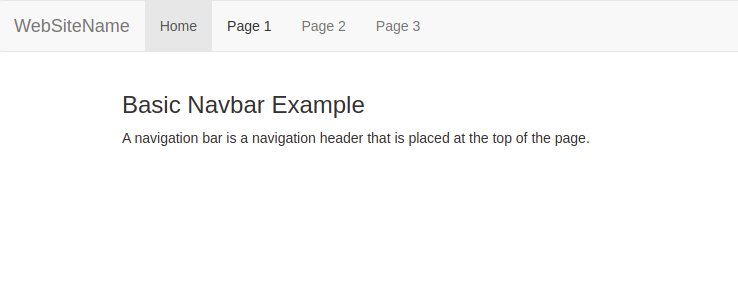
<h3>Basic Navbar Example</h3>
<p>A navigation bar is a navigation header that is placed at the top of the page.</p>
</div>
</body>
</html>
code
نسخ
اقتباس
عرض
تنزيل
<!DOCTYPE html>
<html lang=\"en\">
<head>
<title>Bootstrap Example</title>
<meta charset=\"utf-8\">
<meta name=\"viewport\" content=\"width=device-width, initial-scale=1\">
<link rel=\"stylesheet\" href=\"https://maxcdn.bootstrapcdn.com/bootstrap/3.4.1/css/bootstrap.min.css\">
<script src=\"https://ajax.googleapis.com/ajax/libs/jquery/3.5.1/jquery.min.js\"></script>
<script src=\"https://maxcdn.bootstrapcdn.com/bootstrap/3.4.1/js/bootstrap.min.js\"></script>
</head>
<body>
<nav class=\"navbar navbar-inverse\">
<div class=\"container-fluid\">
<div class=\"navbar-header\">
<a class=\"navbar-brand\" href=\"#\">WebSiteName</a>
</div>
<ul class=\"nav navbar-nav\">
<li class=\"active\"><a href=\"#\">Home</a></li>
<li class=\"dropdown\"><a class=\"dropdown-toggle\" data-toggle=\"dropdown\" href=\"#\">Page 1 <span class=\"caret\"></span></a>
<ul class=\"dropdown-menu\">
<li><a href=\"#\">Page 1-1</a></li>
<li><a href=\"#\">Page 1-2</a></li>
<li><a href=\"#\">Page 1-3</a></li>
</ul>
</li>
<li><a href=\"#\">Page 2</a></li>
</ul>
<ul class=\"nav navbar-nav navbar-right\">
<li><a href=\"#\"><span class=\"glyphicon glyphicon-user\"></span> Sign Up</a></li>
<li><a href=\"#\"><span class=\"glyphicon glyphicon-log-in\"></span> Login</a></li>
</ul>
</div>
</nav>
<div class=\"container\">
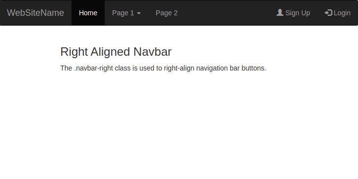
<h3>Right Aligned Navbar</h3>
<p>The .navbar-right class is used to right-align navigation bar buttons.</p>
</div>
</body>
</html>
code
نسخ
اقتباس
عرض
تنزيل
<!DOCTYPE html>
<html lang=\"en\">
<head>
<title>Bootstrap Example</title>
<meta charset=\"utf-8\">
<meta name=\"viewport\" content=\"width=device-width, initial-scale=1\">
<link rel=\"stylesheet\" href=\"https://maxcdn.bootstrapcdn.com/bootstrap/3.4.1/css/bootstrap.min.css\">
<script src=\"https://ajax.googleapis.com/ajax/libs/jquery/3.5.1/jquery.min.js\"></script>
<script src=\"https://maxcdn.bootstrapcdn.com/bootstrap/3.4.1/js/bootstrap.min.js\"></script>
</head>
<body>
<nav class=\"navbar navbar-inverse\">
<div class=\"container-fluid\">
<div class=\"navbar-header\">
<a class=\"navbar-brand\" href=\"#\">WebSiteName</a>
</div>
<ul class=\"nav navbar-nav\">
<li class=\"active\"><a href=\"#\">Home</a></li>
<li><a href=\"#\">Page 1</a></li>
<li><a href=\"#\">Page 2</a></li>
</ul>
<form class=\"navbar-form navbar-left\" action=\"/action_page.php\">
<div class=\"input-group\">
<input type=\"text\" class=\"form-control\" placeholder=\"Search\" name=\"search\">
<div class=\"input-group-btn\">
<button class=\"btn btn-default\" type=\"submit\">
<i class=\"glyphicon glyphicon-search\"></i>
</button>
</div>
</div>
<button type=\"submit\" class=\"btn btn-default\">Submit</button>
</form>
</div>
</nav>
<div class=\"container\">
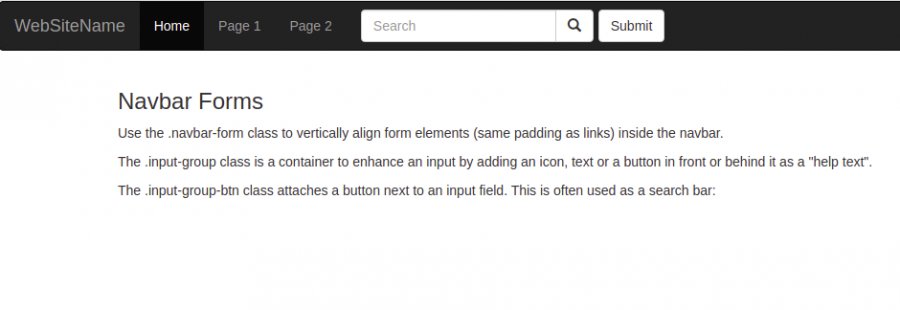
<h3>Navbar Forms</h3>
<p>Use the .navbar-form class to vertically align form elements (same padding as links) inside the navbar.</p>
<p>The .input-group class is a container to enhance an input by adding an icon, text or a button in front or behind it as a \"help text\".</p>
<p>The .input-group-btn class attaches a button next to an input field. This is often used as a search bar:</p>
</div>
</body>
</html>
code
نسخ
اقتباس
عرض
تنزيل
<!DOCTYPE html>
<html lang=\"en\">
<head>
<title>Bootstrap Example</title>
<meta charset=\"utf-8\">
<meta name=\"viewport\" content=\"width=device-width, initial-scale=1\">
<link rel=\"stylesheet\" href=\"https://maxcdn.bootstrapcdn.com/bootstrap/3.4.1/css/bootstrap.min.css\">
<script src=\"https://ajax.googleapis.com/ajax/libs/jquery/3.5.1/jquery.min.js\"></script>
<script src=\"https://maxcdn.bootstrapcdn.com/bootstrap/3.4.1/js/bootstrap.min.js\"></script>
</head>
<body>
<nav class=\"navbar navbar-inverse navbar-fixed-bottom\">
<div class=\"container-fluid\">
<div class=\"navbar-header\">
<a class=\"navbar-brand\" href=\"#\">WebSiteName</a>
</div>
<ul class=\"nav navbar-nav\">
<li class=\"active\"><a href=\"#\">Home</a></li>
<li><a href=\"#\">Page 1</a></li>
<li><a href=\"#\">Page 2</a></li>
<li><a href=\"#\">Page 3</a></li>
</ul>
</div>
</nav>
<div class=\"container\">
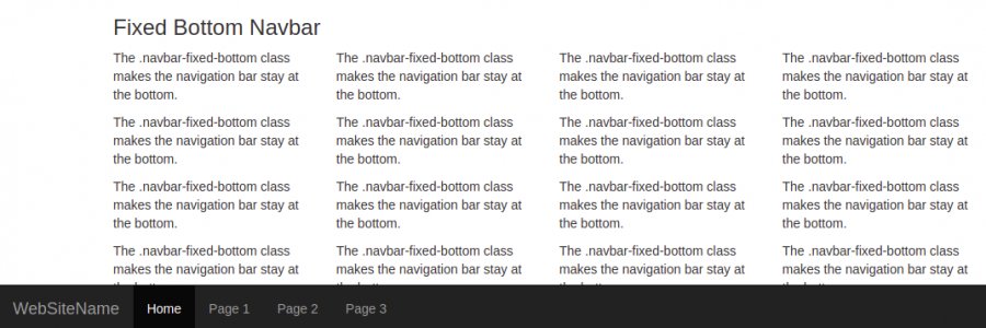
<h3>Fixed Bottom Navbar</h3>
<div class=\"row\">
<div class=\"col-md-3\">
<p>The .navbar-fixed-bottom class makes the navigation bar stay at the bottom.</p>
</div>
<div class=\"col-md-3\">
<p>The .navbar-fixed-bottom class makes the navigation bar stay at the bottom.</p>
</div>
<div class=\"col-md-3\">
<p>The .navbar-fixed-bottom class makes the navigation bar stay at the bottom.</p>
</div>
<div class=\"col-md-3\">
<p>The .navbar-fixed-bottom class makes the navigation bar stay at the bottom.</p>
</div>
<div class=\"clearfix visible-lg\"></div>
</div>
</div>
<div class=\"container\">
<div class=\"row\">
<div class=\"col-md-3\">
<p>The .navbar-fixed-bottom class makes the navigation bar stay at the bottom.</p>
</div>
<div class=\"col-md-3\">
<p>The .navbar-fixed-bottom class makes the navigation bar stay at the bottom.</p>
</div>
<div class=\"col-md-3\">
<p>The .navbar-fixed-bottom class makes the navigation bar stay at the bottom.</p>
</div>
<div class=\"col-md-3\">
<p>The .navbar-fixed-bottom class makes the navigation bar stay at the bottom.</p>
</div>
<div class=\"clearfix visible-lg\"></div>
</div>
</div>
</body>
</html>