code
نسخ
اقتباس
عرض
تنزيل
<!DOCTYPE html>
<html lang=\"en\">
<head>
<title>Bootstrap Example</title>
<meta charset=\"utf-8\">
<meta name=\"viewport\" content=\"width=device-width, initial-scale=1\">
<link rel=\"stylesheet\" href=\"https://maxcdn.bootstrapcdn.com/bootstrap/3.4.1/css/bootstrap.min.css\">
<script src=\"https://ajax.googleapis.com/ajax/libs/jquery/3.5.1/jquery.min.js\"></script>
<script src=\"https://maxcdn.bootstrapcdn.com/bootstrap/3.4.1/js/bootstrap.min.js\"></script>
</head>
<body>
<div class=\"container\">
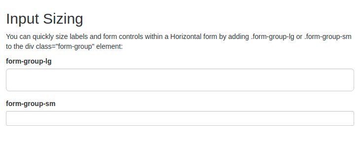
<h2>Input Sizing</h2>
<p>You can quickly size labels and form controls within a Horizontal form by adding .form-group-lg or .form-group-sm to the div class=\"form-group\" element:</p>
<form class=\"form-horizontal\">
<div class=\"form-group form-group-lg\">
<label class=\"col-sm-2 control-label\" for=\"lg\">form-group-lg</label>
<div class=\"col-sm-10\">
<input class=\"form-control\" type=\"text\" id=\"lg\">
</div>
</div>
<div class=\"form-group form-group-sm\">
<label class=\"col-sm-2 control-label\" for=\"sm\">form-group-sm</label>
<div class=\"col-sm-10\">
<input class=\"form-control\" type=\"text\" id=\"sm\">
</div>
</div>
</form>
</div>
</body>
</html>
code
نسخ
اقتباس
عرض
تنزيل
								<!DOCTYPE html>
<html lang=\"en\">
<head>
  <title>Bootstrap Example</title>
  <meta charset=\"utf-8\">
  <meta name=\"viewport\" content=\"width=device-width, initial-scale=1\">
  <link rel=\"stylesheet\" href=\"https://maxcdn.bootstrapcdn.com/bootstrap/3.4.1/css/bootstrap.min.css\">
  <script src=\"https://ajax.googleapis.com/ajax/libs/jquery/3.5.1/jquery.min.js\"></script>
  <script src=\"https://maxcdn.bootstrapcdn.com/bootstrap/3.4.1/js/bootstrap.min.js\"></script>
</head>
<body>

<div class=\"container\">
  <h2>Input Sizing</h2>
  <p>The form below shows input elements with different heights using .input-lg and .input-sm:</p>
  <form>
    <div class=\"form-group\">
      <label for=\"inputdefault\">Default input</label>
      <input class=\"form-control\" id=\"inputdefault\" type=\"text\">
    </div>
    <div class=\"form-group\">
      <label for=\"inputlg\">input-lg</label>
      <input class=\"form-control input-lg\" id=\"inputlg\" type=\"text\">
    </div>
    <div class=\"form-group\">
      <label for=\"inputsm\">input-sm</label>
      <input class=\"form-control input-sm\" id=\"inputsm\" type=\"text\">
    </div>
    <div class=\"form-group\">
      <label for=\"sel1\">Default select list</label>
      <select class=\"form-control\" id=\"sel1\">
        <option>1</option>
        <option>2</option>
        <option>3</option>
        <option>4</option>
      </select>
    </div>
    <div class=\"form-group\">
      <label for=\"sel2\">input-lg</label>
      <select class=\"form-control input-lg\" id=\"sel2\">
        <option>1</option>
        <option>2</option>
        <option>3</option>
      </select>
    </div>
    <div class=\"form-group\">
      <label for=\"sel3\">input-sm</label>
      <select class=\"form-control input-sm\" id=\"sel3\">
        <option>1</option>
        <option>2</option>
        <option>3</option>
      </select>
    </div>
  </form>
</div>

</body>
</html>
code
نسخ
اقتباس
عرض
تنزيل
								<!DOCTYPE html>
<html lang=\"en\">
<head>
  <title>Bootstrap Example</title>
  <meta charset=\"utf-8\">
  <meta name=\"viewport\" content=\"width=device-width, initial-scale=1\">
  <link rel=\"stylesheet\" href=\"https://maxcdn.bootstrapcdn.com/bootstrap/3.4.1/css/bootstrap.min.css\">
  <script src=\"https://ajax.googleapis.com/ajax/libs/jquery/3.5.1/jquery.min.js\"></script>
  <script src=\"https://maxcdn.bootstrapcdn.com/bootstrap/3.4.1/js/bootstrap.min.js\"></script>
</head>
<body>

<div class=\"container\">
  <h1>Input Group Size</h1>
  <p>The .input-group class is a container to enhance an input by adding an icon, text or a button in front or behind it as a \"help text\".</p>
  <p>Use the .input-group-lg if you want a large input group:</p>
  <form>
    <div class=\"input-group input-group-lg\">
      <input type=\"text\" class=\"form-control\" placeholder=\"Search\">
      <div class=\"input-group-btn\">
        <button class=\"btn btn-default\" type=\"submit\"><i class=\"glyphicon glyphicon-search\"></i></button>
      </div>
    </div>
  </form>
  <br>

  <p>Use the .input-group-sm if you want a small input group:</p>
  <form>
    <div class=\"input-group input-group-sm\">
      <input type=\"text\" class=\"form-control\" placeholder=\"Search\">
      <div class=\"input-group-btn\">
        <button class=\"btn btn-default\" type=\"submit\"><i class=\"glyphicon glyphicon-search\"></i></button>
      </div>
    </div>
  </form>
</div>

</body>
</html>
code
نسخ
اقتباس
عرض
تنزيل
<!DOCTYPE html>
<html lang=\"en\">
<head>
<title>Bootstrap Example</title>
<meta charset=\"utf-8\">
<meta name=\"viewport\" content=\"width=device-width, initial-scale=1\">
<link rel=\"stylesheet\" href=\"https://maxcdn.bootstrapcdn.com/bootstrap/3.4.1/css/bootstrap.min.css\">
<script src=\"https://ajax.googleapis.com/ajax/libs/jquery/3.5.1/jquery.min.js\"></script>
<script src=\"https://maxcdn.bootstrapcdn.com/bootstrap/3.4.1/js/bootstrap.min.js\"></script>
</head>
<body>
<div class=\"container\">
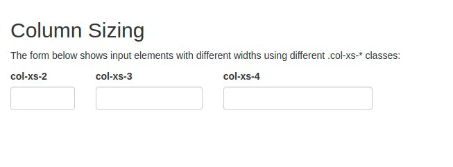
<h2>Column Sizing</h2>
<p>The form below shows input elements with different widths using different .col-xs-* classes:</p>
<form>
<div class=\"form-group row\">
<div class=\"col-xs-2\">
<label for=\"ex1\">col-xs-2</label>
<input class=\"form-control\" id=\"ex1\" type=\"text\">
</div>
<div class=\"col-xs-3\">
<label for=\"ex2\">col-xs-3</label>
<input class=\"form-control\" id=\"ex2\" type=\"text\">
</div>
<div class=\"col-xs-4\">
<label for=\"ex3\">col-xs-4</label>
<input class=\"form-control\" id=\"ex3\" type=\"text\">
</div>
</div>
</form>
</div>
</body>
</html>
code
نسخ
اقتباس
عرض
تنزيل
<!DOCTYPE html>
<html lang=\"en\">
<head>
<title>Bootstrap Example</title>
<meta charset=\"utf-8\">
<meta name=\"viewport\" content=\"width=device-width, initial-scale=1\">
<link rel=\"stylesheet\" href=\"https://maxcdn.bootstrapcdn.com/bootstrap/3.4.1/css/bootstrap.min.css\">
<script src=\"https://ajax.googleapis.com/ajax/libs/jquery/3.5.1/jquery.min.js\"></script>
<script src=\"https://maxcdn.bootstrapcdn.com/bootstrap/3.4.1/js/bootstrap.min.js\"></script>
</head>
<body>
<div class=\"container\">
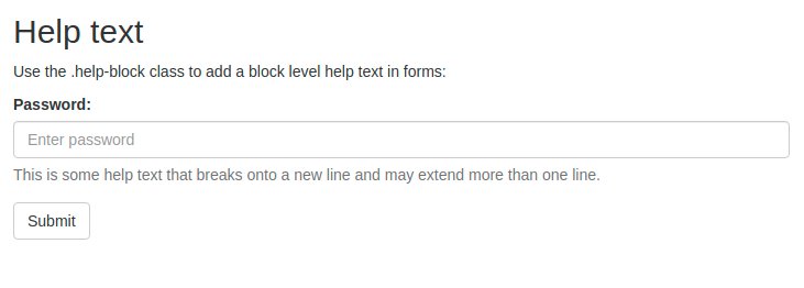
<h2>Help text</h2>
<p>Use the .help-block class to add a block level help text in forms:</p>
<form>
<div class=\"form-group\">
<label for=\"pwd\">Password:</label>
<input type=\"password\" class=\"form-control\" id=\"pwd\" placeholder=\"Enter password\">
<span class=\"help-block\">This is some help text that breaks onto a new line and may extend more than one line.</span>
</div>
<button type=\"submit\" class=\"btn btn-default\">Submit</button>
</form>
</div>
</body>
</html>